

How Color Psychology Influences Our Daily Decisions
Have you ever walked into a room and instantly felt a sense of calm? Or felt a sudden urge to buy a product simply because its packaging was a vibrant, eye-catching color? If you've ever wondered why the fast-food logos are often red and yellow, or why hospitals frequently use shades of blue and green, you've stumbled upon the powerful, often subconscious, world of color psychology.

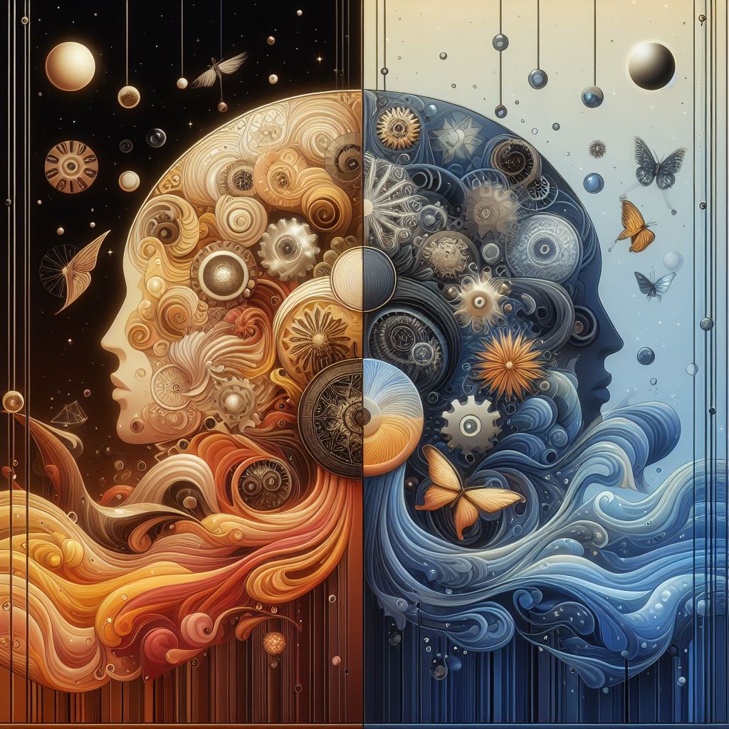
Color is more than just a visual experience; it's a silent language that speaks to our deepest instincts and emotions. It’s a subtle force that constantly shapes our perceptions, influences our moods, and guides our decisions in ways we rarely notice. From the clothes we choose to wear to the brands we trust, color is the unsung hero (or villain) in the story of our daily lives.
A Brief History of Chromatic Influence
The idea that colors can affect our well-being is not a modern concept. In fact, it has ancient roots. The ancient Egyptians, for instance, studied the effects of different colors on mood and used them for holistic health benefits. They believed specific colors could heal various ailments and even designed solariums with colored glass to harness these therapeutic properties. The Egyptian word for color, 'iwn', also translated to 'disposition' or 'character', showing an intrinsic link between color and personality in their culture.
This ancient wisdom was carried through by the Greeks and Romans and was a component of traditional Chinese medicine. However, it wasn't until 1810 that the German poet and artist Johann Wolfgang von Goethe published his "Theory of Colours." While dismissed by some in the scientific community at the time, his work was one of the first comprehensive explorations of the psychological impact of colors, delving into how they affect mood and emotion.
The field gained more scientific traction in the 20th century with the rise of modern psychology. Swiss psychiatrist Carl Jung, a pioneer in the field, famously stated, “colors are the mother tongue of the subconscious.” He developed art therapies based on the belief that expressing oneself through color could help patients process trauma and distress.
The Science Behind the Spectrum: How We Process Color
So, how does a simple wavelength of light manage to pack such an emotional punch? The process begins in our eyes, where photoreceptor cells known as cones detect different wavelengths of light—short (blue), medium (green), and long (red). These signals are then sent via the optic nerve to the brain's visual cortex, where the information is processed and interpreted as color.
But it doesn't stop there. This visual information triggers a cascade of neural activity. Color signals can stimulate the hypothalamus, a part of the brain that influences our hormones and endocrine system, making us feel happy, hungry, or even angry. This is why looking at certain colors can have measurable physiological effects, such as altering our heart rate, blood pressure, and respiration.
Our brains are hardwired to like or dislike certain colors due to a mix of evolutionary bias and personal associations. For example, humans tend to favor colors like blue, green, and red, which historically signified essentials for survival like clear water, healthy crops, or ripe food.
The Warm Embrace and The Cool Calm: A Tale of Two Temperatures
The color wheel is broadly divided into two main categories: warm colors and cool colors. Each group has a distinct psychological impact that designers, marketers, and even therapists leverage to influence our state of mind.
H3: The Energy of Warm Colors: Red, Orange, and Yellow
Warm colors are the extroverts of the color spectrum. Think of the sun, fire, and autumn leaves. These hues are associated with energy, passion, and happiness. They are stimulating and can even increase heart rate, blood pressure, and metabolism.
- Red: The most intense of the warm colors, red is a powerhouse of emotion. It signifies love, passion, and excitement, but also danger and urgency. It's why stop signs and clearance sale banners are red—it grabs our attention and prompts action. It's also known to stimulate appetite, a fact not lost on brands like Coca-Cola and McDonald's.
- Orange: A vibrant blend of red's energy and yellow's cheerfulness, orange is seen as enthusiastic, creative, and friendly. It promotes social interaction and is often used to create a sense of fun and affordability.
- Yellow: The color of sunshine, yellow is overwhelmingly associated with optimism, happiness, and warmth. It's highly visible and can stimulate mental activity and memory. However, too much yellow can sometimes lead to feelings of frustration or anxiety.
H3: The Serenity of Cool Colors: Blue, Green, and Purple
On the other side of the wheel are the cool colors, the introverts. These shades are reminiscent of nature, water, and the sky, and they generally have a calming and soothing effect on us. They can lower blood pressure, slow the heart rate, and reduce anxiety.
- Blue: Often cited as the world's favorite color, blue is the king of calm. It evokes feelings of trust, stability, and peace. This makes it a popular choice for corporate and financial institutions like IBM and PayPal, who want to project an image of security and reliability.
- Green: As the color of nature, green symbolizes growth, balance, and harmony. It's the easiest color for the human eye to process, which makes it restful and restorative. Brands use green to signify health, sustainability, and natural products.
- Purple: Historically associated with royalty and luxury, purple blends the passion of red with the calm of blue. It suggests wisdom, creativity, and sophistication. Lighter shades like lavender can be serene, while deeper purples feel more dramatic and luxurious. Brands like Cadbury and Hallmark use purple to convey quality and a touch of exclusivity.
Quick Facts
- Up to 90% of snap judgments made about products can be based on color alone.
- Color can increase brand recognition by up to 80%.
- 85% of consumers cite color as the primary reason they purchase a specific product.
- In a study, a red call-to-action button outperformed a green one by 21%.
- Blue is the most popular favorite color for both men (57%) and women (35%).
Color in Action: How It Shapes Our World
The principles of color psychology are not just theoretical; they are actively applied all around us, subtly nudging our choices every single day.
H3: The Colors of Commerce: Branding and Marketing
In the world of marketing, color is everything. It's a critical tool for shaping brand personality and influencing consumer behavior. The right color can help a brand stand out from competitors and create an immediate, recognizable identity. Think of Tiffany & Co.'s robin's-egg blue or Cadbury's distinctive purple—these colors are so iconic they are practically synonymous with the brands themselves.
Brands carefully select colors to evoke specific feelings. A bank will use a stable color like blue to communicate trust. A fast-food chain will use red and yellow to create excitement and stimulate hunger. An organic food company will use green to signal health and nature. The goal is to align the perceived personality of the color with the desired personality of the brand.
H3: The Hue of Home: Interior Design
The colors we choose for our living spaces have a profound impact on our mood and well-being. Interior designers use color psychology to create specific atmospheres within a home.
Warm colors like terracotta and soft reds can make a large room feel cozier and more intimate, encouraging social interaction and conversation. This makes them great for living rooms and dining areas. In contrast, cool colors like soft blues and greens are ideal for bedrooms and bathrooms, as they promote relaxation and tranquility. Lighter colors can make a small room feel more spacious and airy, while darker colors create a sense of intimacy and coziness.
A study found that people who sleep in blue bedrooms tend to experience improved sleep quality, as the color is associated with calmness and can help lower heart rate and blood pressure.
A Spectrum of Meaning: The Cultural Factor
It's crucial to remember that the meaning of color is not always universal. The symbolism and psychological response to colors can vary dramatically across different cultures. What might be a happy, celebratory color in one country could be a symbol of mourning in another.
- White: In Western cultures, white is the color of purity, innocence, and weddings. However, in many East Asian cultures, white is the traditional color of death and mourning.
- Red: While associated with love and danger in the West, red is a color of prosperity, good luck, and happiness in many Asian cultures, particularly in China, where it is the traditional color for brides.
- Green: A symbol of nature and luck in many Western countries, green can signify infidelity in China. It is also a color with strong associations with Islam.
This cultural context is vital in our increasingly globalized world, especially for international brands and designers. A color choice that works perfectly in one market could be a major misstep in another.
Conclusion: Living in a Colorful World
From the moment we open our eyes, we are immersed in a world of color that does more than just please our senses. It speaks a silent, powerful language that influences our emotions, shapes our perceptions, and guides our decisions. That feeling of calm in a blue-painted room or the inexplicable pull towards a brightly colored package is not just a coincidence; it's the subtle, pervasive force of color psychology at work.
The next time you find yourself making a choice, take a moment to look around. Consider the colors of the brands you favor, the clothes you're wearing, and the room you're in. You might just discover that your decisions are being painted by a palette you never even knew existed, a constant, colorful conversation between you and the world around you.