

How Optical Art Fools Your Visual System
Have you ever stared at a work of art and felt the lines begin to vibrate, the colors pulse, or the entire canvas seem to swell and recede before your very eyes? If so, you've likely encountered the mesmerizing world of Optical Art, or Op Art. It’s not a magic trick, but a masterful manipulation of your own visual system. Op Art is more than just a collection of clever designs; it’s a profound exploration into the very nature of perception, turning the passive act of looking into an active, and often disorienting, experience.
This artistic movement, which exploded into the public consciousness in the 1960s, uses precise, mathematically-based compositions to fool your brain. It’s a genre where the real action happens not on the canvas, but in the space between your retina and your brain. So, how exactly do these static images spring to life and play tricks on our minds? Let's dive into the visual rabbit hole of Op Art and unravel the secrets behind how it so effectively fools your visual system.
What is Op Art? A Collision of Art and Science
Op Art is a style of abstract art that leverages geometric shapes, patterns, and stark color contrasts to create a range of optical illusions. These illusions can manifest as the impression of movement, hidden images, flashing, vibrating patterns, or a sense of warping and swelling on a two-dimensional surface. Unlike traditional art that might depict a realistic scene or an emotional concept, the primary subject of Op Art is the viewer's own perception.
The movement didn't just appear out of thin air. Its roots can be traced back to early 20th-century art and color theory, including the work of the Bauhaus school in Germany, which emphasized a rational, analytical approach to design. Artists have been fascinated with illusion for centuries, from the "trompe-l'œil" (French for "deceive the eye") techniques of the Renaissance to the Pointillist paintings of Georges Seurat, who used dots of color to create luminosity through optical mixing. However, it was in the mid-20th century that these interests, combined with a growing fascination with psychology and technology, coalesced into a distinct movement.
The Rise to Prominence
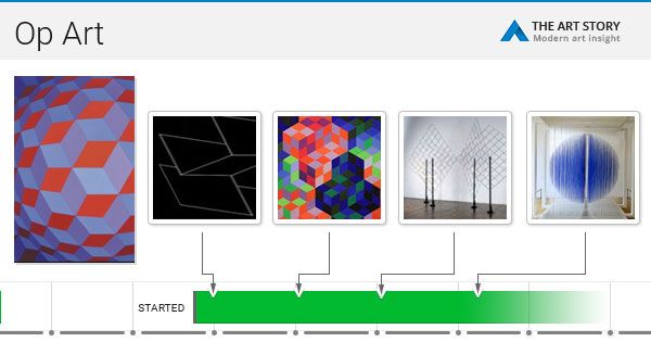
The term "Op Art" was famously coined by Time magazine in 1964. The movement's watershed moment arrived in 1965 with a landmark exhibition at the Museum of Modern Art (MoMA) in New York City titled "The Responsive Eye." This show, featuring 123 works by artists like Victor Vasarely, Bridget Riley, and Jesús Rafael Soto, captivated the public and catapulted Op Art to international fame. Suddenly, these mind-bending patterns were not just in galleries but were influencing fashion, graphic design, and advertising.
Quick Facts
- Coined Term: The term "Op Art" first appeared in a Time magazine article in October 1964.
- Key Exhibition: "The Responsive Eye" at MoMA in 1965 was the exhibition that brought Op Art to global attention.
- "Grandfather" of Op Art: French-Hungarian artist Victor Vasarely is often considered the pioneer of the movement, with works like Zebras (1938) being an early example.
- Not Just Black and White: While many iconic Op Art pieces are monochromatic to maximize contrast, artists also extensively used color to create chromatic tension and afterimages.
The Neurological Glitch: How Op Art Hacks Your Brain
To understand how Op Art works, we need a quick lesson in how we see. Light enters our eyes and hits the retina, which sends electrical signals to the brain. The brain then interprets these signals to construct the world we perceive. Op Art cleverly exploits the shortcuts and assumptions our brain makes during this process. The illusions can generally be broken down into two main categories: physiological and cognitive.

Physiological Illusions: Overwhelming the Senses
Physiological illusions occur when the visual system is overstimulated by intense or repetitive input, like brightness, color, or movement. This overstimulation causes a kind of fatigue in the photoreceptor cells in your eyes, leading to confusing aftereffects.
A classic example is the afterimage effect. If you stare at a brightly colored shape for a while and then look away at a white surface, you'll see a ghostly version of the shape in its complementary color. Op artists like Carlos Cruz-Diez masterfully used this, creating works where staring at a blue stripe could produce a yellow halo that isn't actually there. This happens because the cells that process blue become tired, and when you look away, the opposing color receptors (yellow) temporarily become more active.
The high-contrast, repetitive patterns in many Op artworks create what neuroscientists call "center/surround antagonism." Hard-edged boundaries between light and dark are exaggerated by our visual system, which is why the intersections in a Hermann Grid illusion appear to have flickering gray dots.
Cognitive Illusions: The Brain as an Interpreter
Cognitive illusions are more about the brain's attempt to make sense of the world using learned rules and assumptions. Our brains are wired to see patterns, recognize objects, and perceive depth, even when the visual information is ambiguous or contradictory. Op artists play with these ingrained tendencies.
One of the most powerful tools they use is the manipulation of perspective. Artists like Victor Vasarely applied the principles of linear perspective, traditionally used to create realistic depth in landscapes, to abstract geometric shapes. By altering the size and shape of squares in a grid, he could make a flat canvas appear to bulge outwards or recede into a deep tunnel.
Key Artists and Their Signature Techniques
While many artists contributed to the Op Art movement, a few stand out for their pioneering techniques and iconic works that perfectly demonstrate how to fool the visual system.
Victor Vasarely: The Architect of Illusion
Often hailed as the "grandfather" of Op Art, Victor Vasarely's work was deeply rooted in his graphic design background. He systematically explored the relationship between color and form, creating a "visual alphabet" that he could use to generate his illusions. His 1938 painting Zebras, with its interlocking black and white stripes that defy a clear sense of foreground and background, is considered one of the earliest examples of the style.
Vasarely's mature work often involves grids of squares, circles, and other shapes that are subtly altered in size, angle, or color. These modifications trick the brain into perceiving three-dimensional structures, like spheres or cubes, on a two-dimensional plane. His work is a masterclass in using geometric precision to create the illusion of volume and depth.
Bridget Riley: The Master of Movement
British artist Bridget Riley is perhaps the most famous practitioner of Op Art, known for her dynamic black-and-white compositions from the 1960s. Works like Movement in Squares (1961) and Current (1964) use meticulously arranged lines and shapes to create a powerful sensation of movement and vibration.
Riley's secret lies in creating instability. The eye struggles to find a focal point amidst the repetitive, high-contrast patterns. This causes tiny, involuntary eye movements called microsaccades to go into overdrive. As your eye scans the painting, unable to rest, the static lines appear to wave, ripple, and shimmer. As she once said, "My paintings are multifocal... Not being fixed to a single focus is very much of our time."
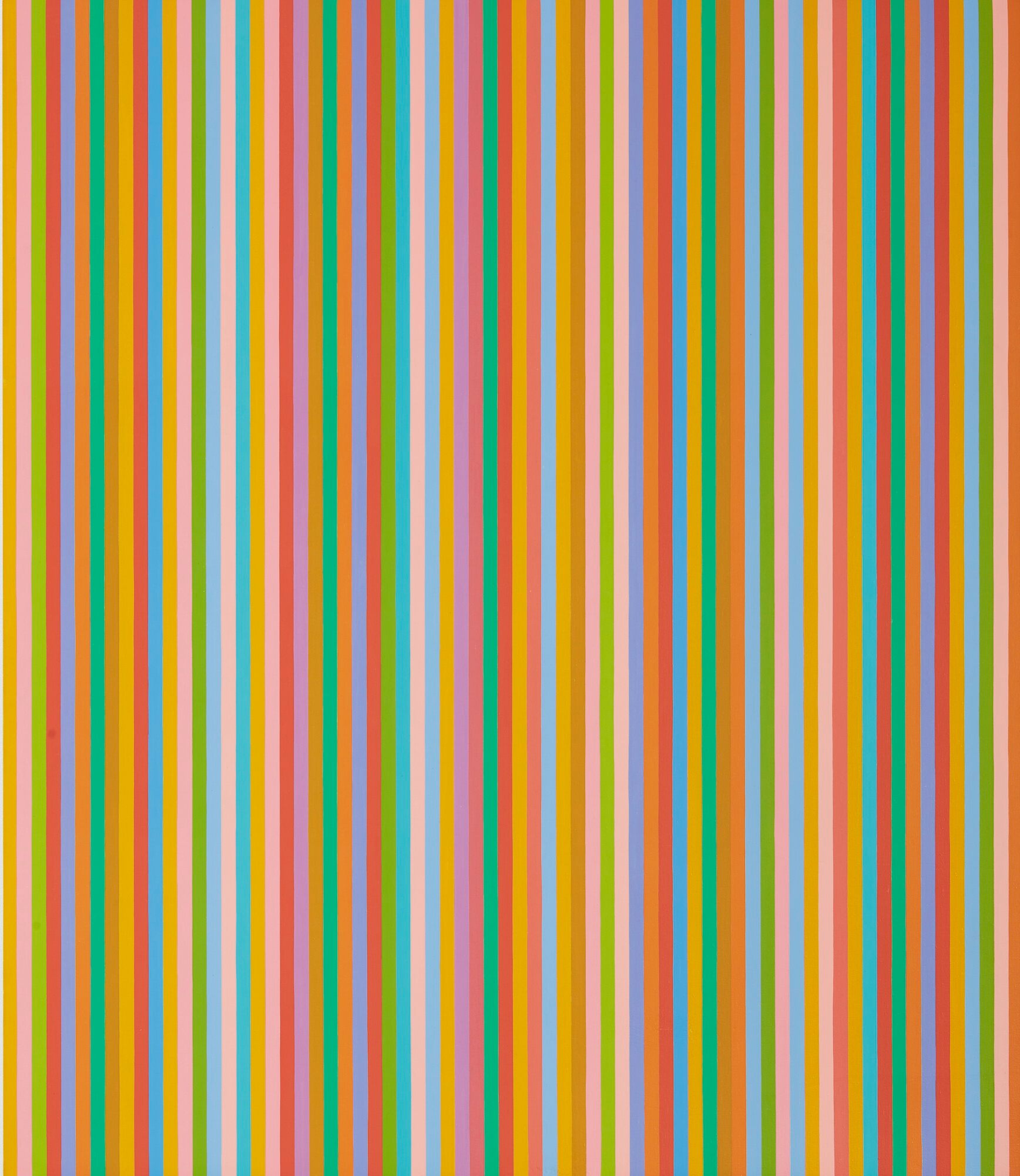
The Role of Color in Creating Confusion
While black and white provided the starkest contrast, other Op artists like Richard Anuszkiewicz and Carlos Cruz-Diez were pioneers in using color to create optical effects. They explored several principles:
- Simultaneous Contrast: This phenomenon, where the perception of a color is affected by the colors surrounding it, was a key tool. A grey square will look different against a blue background than a yellow one.
- Chromatic Tension: Placing complementary colors (opposites on the color wheel, like red and green) of equal intensity next to each other creates a visual flicker or vibration. The eye struggles to process both colors at once, resulting in an unstable, shimmering effect.
- Advancing and Receding Colors: Artists use our psychological perception of color to create depth. Warm colors like red and yellow tend to "advance" or appear closer, while cool colors like blue and green "recede" or seem farther away.
The Science Behind the Shimmer and Shake
The visual effects of Op Art are not just artistic tricks; they are rooted in the biology of our visual system. Neuroscientists have studied these artworks to better understand how the brain processes visual information. The feeling of movement in a static Op Art piece is a prime example.
When you look at a high-contrast, patterned image, the neurons in your visual cortex that detect motion can become confused. The repetitive nature of the pattern can trigger these neurons in a way that mimics the signals they would receive from a genuinely moving object. Your brain, trying to make sense of this conflicting information, concludes that the object must be moving. It’s a fascinating glitch in our neural processing.
"Artists may not study the neuroscience per se, but they're experimentalists." - Margaret Livingstone, Professor of Neurobiology, Harvard Medical School
Beyond the Canvas: The Enduring Legacy of Op Art
Though its peak as a major art movement was relatively brief, the influence of Op Art is undeniable. It demonstrated that a work of art could be an active experience, a "generator of perceptual responses," rather than a passive object. Its principles were quickly adopted by the design and fashion worlds in the 1960s, leading to a "craze" for Op Art patterns on everything from dresses to wallpaper.
Today, the legacy of Op Art lives on. Contemporary artists continue to explore perception and illusion, and its aesthetic can be seen in digital art, animation, and user interface design. It reminds us that seeing is a constructive process, an active collaboration between our eyes and our brain.
Conclusion: The Art That Looks Back
Op Art does more than just fool your visual system; it reveals it. By pushing the boundaries of perception, these artworks make us acutely aware of the complex, and sometimes fallible, processes that create our sense of reality. The vibrating lines, swelling grids, and pulsing colors are not just illusions on a canvas; they are echoes of the intricate neural dance happening inside our own heads.

The next time you find yourself captivated by a shimmering, shifting work of Op Art, remember what you're truly experiencing. You're not just looking at a painting; you're looking at the inner workings of your own mind. The art is static, but your perception is alive, and in that dynamic interaction, you become a part of the piece itself. The trick, it turns out, is on us—and it's a beautiful one.